Heatmap
The Heatmap shows a group of symbols as a treemap — a grid of tiles where the size and colour of each tile encode how that symbol is doing. It's the fastest way to see, at a glance, where the strength and weakness are across a list you care about.
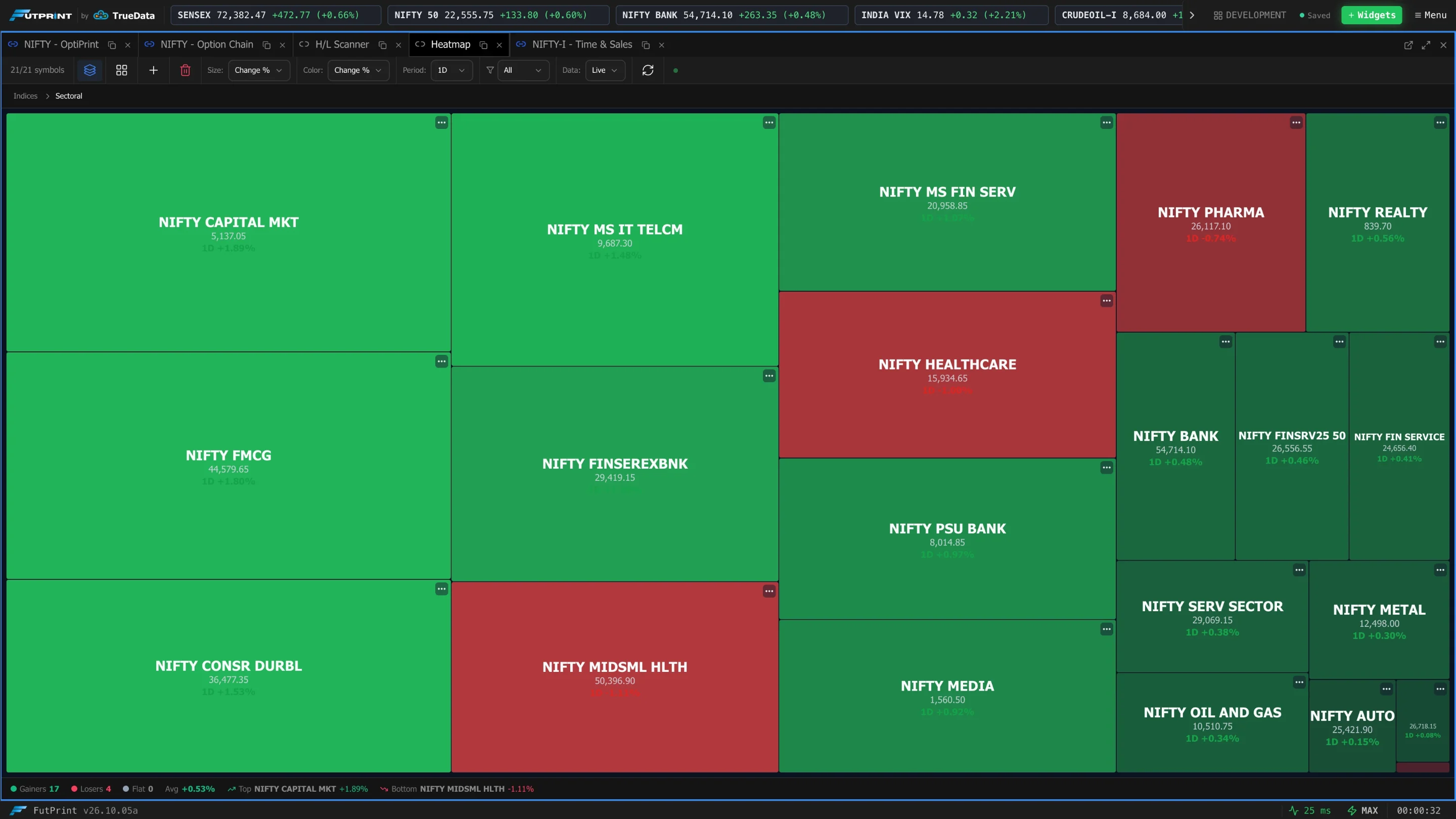
Reading a tile
Depending on how much room a tile has, it shows up to four lines:
- Symbol
- Last price (LTP)
- Period + change % — e.g.
1D +2.41% - Volume — e.g.
Vol 1.2M
Small tiles drop the lower lines to stay legible; the tiniest tiles show just the
symbol or nothing. Hover any tile for a tooltip with the full
symbol | price | change | volume.
- Colour by change: green for up, red for down. The shade is adaptive — intensity scales to the spread of the current list (using the 90th-percentile move as the reference) so a single outlier doesn't wash everything out, and even small moves stay visible.
- Colour by volume: a blue gradient, darker for higher volume.
The controls
All controls live in the toolbar. If it's too narrow, ‹ › arrows scroll it.
| Control | Options | Effect |
|---|---|---|
| Title + status | — | Green dot when receiving live data; a spinner shows while data is loading. |
| Count | shown / total | How many tiles are visible after the filter, out of the total. |
Add (+) / Clear | — | Add symbols (single or many) / remove all. |
| Size | Change % · Volume · Equal | What determines each tile's area. |
| Color | Change % · Volume | What each tile's colour represents. |
| Period | 1H · 4H · 1D · 1W · 1M · Gap | The change window used for sizing/colouring. |
| Vol | 1D · 1W · 1M | Volume accumulation window. Appears only when Size or Color is Volume. |
| Filter | All · Gainers · Losers | Show everything, only up names, or only down names. |
| Data | Live · Hist | Stream in real time, or analyse a chosen past date. |
| Date | date picker | The analysis date. Appears only in Hist mode. |
| Refresh | — | Re-fetch data now. |

Size — how big each tile is
- Change % — bigger tiles are the bigger movers (by absolute change in the selected Period). The grid naturally draws your eye to whatever is moving most.
- Volume — bigger tiles are the most heavily traded (over the selected Vol window).
- Equal — every tile the same size; use this when you only care about colour.
Color — what the colour means
- Change % — green/red by direction and magnitude (adaptive intensity).
- Volume — blue intensity by traded volume.
You can mix the two: for example Size = Volume, Color = Change % gives you a classic market-cap-style map where big tiles are the most active names and their colour tells you whether they're up or down.
Period — the change window
1H, 4H, 1D, 1W, 1M measure the change over that look-back. Gap is
special: it's today's opening gap — today's first price versus yesterday's
close — useful before and just after the open.
In Live mode the 1D change uses the live last price against the previous close, so the number matches exactly what your Watchlist shows for the same symbol. Other periods are computed from historical candles.
Filter
Gainers keeps only tiles that are up for the current Period; Losers keeps only those that are down. The empty state will say "No matches for filter" if nothing qualifies — switch back to All to see everything.
Live vs historical
- Live — each symbol streams in real time and the whole map refreshes automatically every few minutes. The 1D figure tracks the live price.
- Hist — pick a date and the map is computed as of the end of that day, so you can study how a group looked on a specific session. (Period defaults to 1D when you switch to Hist.)
Use Refresh any time to force an immediate re-fetch.
Tile actions
- Click a tile to select that symbol (linked panels follow it).
- Hover a tile for a quick menu to open a Chart, Option Chain or Time & Sales for that symbol, or Remove it from the heatmap.
/help-assets/heatmap/tile-hover-menu.mp4The stats footer
When the heatmap has symbols, a summary strip runs along the bottom:
- Gainers / Losers / Flat counts
- Avg — the average change across the list
- Top and Bottom — the single best and worst performer (symbol + change)
- Total Vol — combined volume across the list

Saving your heatmap
The set of symbols is remembered between sessions and saved with your workspace.
You can also export the heatmap to a .json file and import it later or
into another workspace.
Keep separate heatmaps for different baskets — index heavyweights, a sector, your F&O universe — and flip each between Size = Change % (find the movers) and Size = Volume (find where the activity is).