
 by TrueData
Build a repeatable trading workspace
A practical guide to linking watchlists, charts, profiles, order flow and review into one process.
FutPrint by TrueData · Published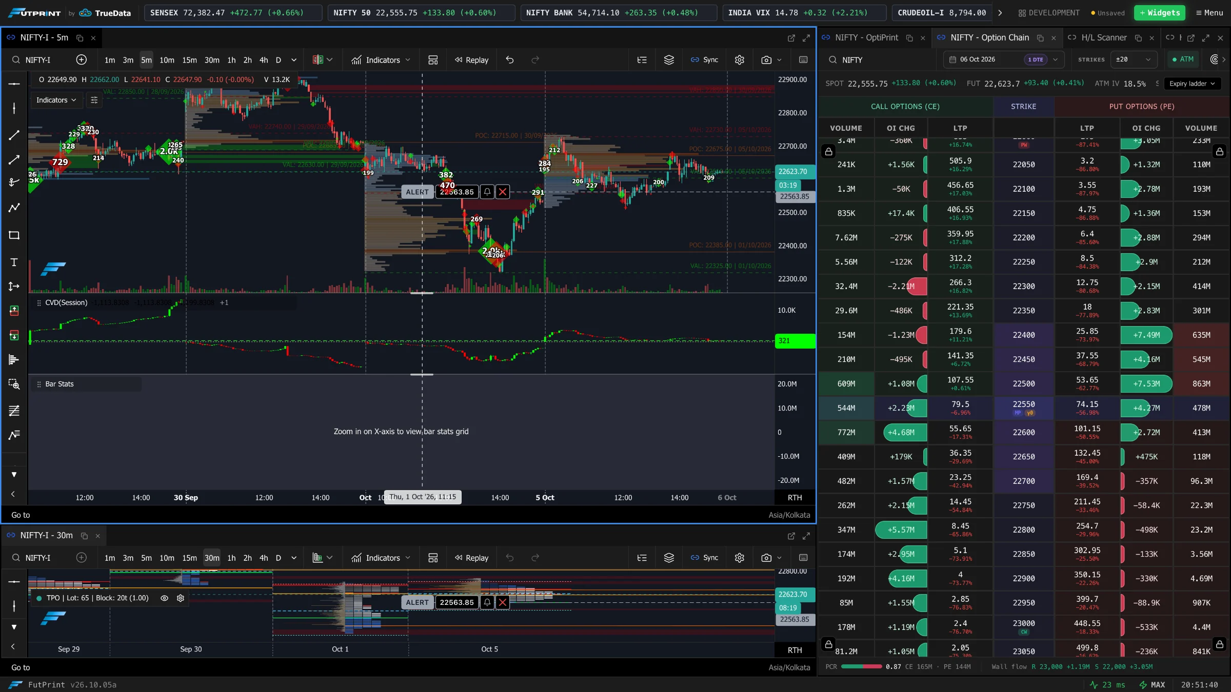
Start with a decision, not a dashboard
A trading workspace is an arrangement of questions. Which instrument deserves attention? Where is it trading relative to the session? What changed at an important price? What evidence would make the current explanation wrong? A useful layout makes these questions easier to answer in sequence. A crowded layout makes them compete for attention, even when every individual panel contains accurate information.
The first design task therefore happens before adding widgets. Write a short description of the activity the workspace must support. Preparing a session, studying footprint behaviour and reviewing completed paper trades are different activities. They require different levels of detail and different controls. Trying to optimise a single screen for all three usually produces compromises that are difficult to notice until the market becomes busy.
This guide builds a process from preparation through review. The examples are organisational exercises rather than recommendations to enter positions. Module availability and instance limits depend on the subscription, while historical coverage depends on the instrument and data available. Design around the tools you actually have and verify their behaviour before relying on a saved template.
Give each panel a clear responsibility
Begin with four responsibilities: discovery, context, investigation and record keeping. Discovery narrows a large market to a manageable set of instruments. Context establishes location and structure. Investigation examines an event more closely. Record keeping preserves what you observed before the outcome was known. These responsibilities can be served by fewer than four visible panels; they are roles, not a minimum widget count.
A watchlist might handle discovery. A conventional chart can hold session levels and broader swings. A footprint can investigate transactions near a selected level. A journal or written note can record the observation. Adding a profile is useful when your question concerns where volume accumulated, but less useful when it merely repeats something you already know. Each addition should answer a question that the existing arrangement cannot answer clearly.
Write the panel's responsibility into your own template notes. “Context chart: identify the prior range and current session location” is more useful than “Chart 1.” If you cannot describe why a panel is visible, temporarily remove it. You can always restore it after identifying a specific missing piece of information. The resulting space often improves readability more than another indicator would.
Use a stable visual hierarchy
The primary chart should usually receive the largest continuous area because it supplies the reference against which smaller observations make sense. Supporting panels need enough width to preserve labels, prices and controls. A footprint compressed until numbers overlap is not a sophisticated display; it is an unreadable one. Resize based on the information that must remain legible, rather than making every rectangle equal.
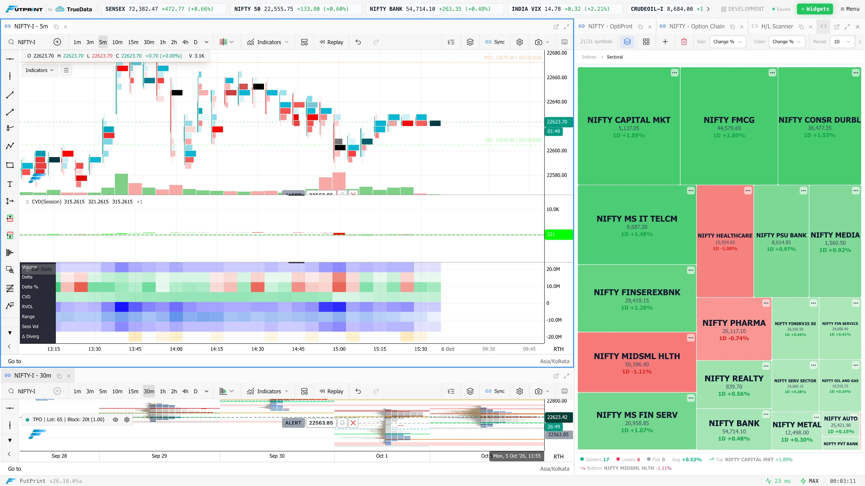
Place related controls near the information they affect. A watchlist beside a linked chart makes symbol changes easy to verify. A detail chart near its context chart reduces the distance your eyes travel when comparing the same event. Put infrequently used material in tabs rather than shrinking all panels to keep everything visible. The objective is a comfortable reading route through the screen.
On smaller displays, use a sequence of saved layouts or tabs instead of recreating a multi-monitor workstation in miniature. A preparation view can give way to a focused investigation view. Keep essential identity information visible in both. A change of layout should not leave you guessing which instrument, expiry, interval or data mode you are currently examining.
Build the watchlist around a purpose
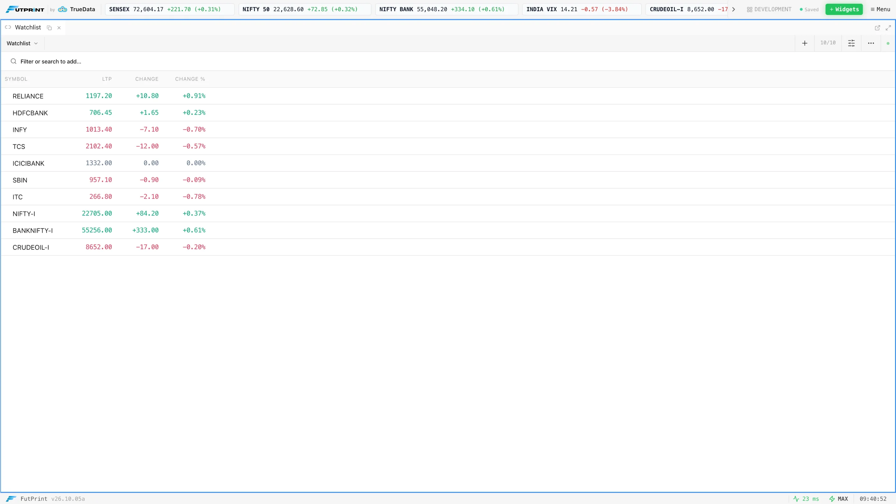
A watchlist should have a membership rule. It might contain a fixed group of contracts you study, instruments selected by a defined scan, or symbols related to a particular sector. An unbounded collection of everything that moved recently makes comparisons harder because liquidity, price scale and trading hours vary. A short, explainable list creates a more reliable baseline for noticing changes.
Choose columns according to the question. Last price alone cannot tell you whether activity is unusual. Percentage change makes some comparisons easier but does not establish opportunity or tradability. A displayed volume figure also needs a unit and session definition. Before ranking symbols, check that the measurements are comparable and that delayed or end-of-day values are not being mistaken for a live stream.
Avoid reorganising the list continually during an observation exercise. If membership changes every few minutes, you lose the baseline against which an instrument first attracted attention. Preserve the initial list or note additions separately. In review, ask whether your selection rule found events relevant to your process or merely directed attention to the largest already-completed moves.
Link symbols deliberately
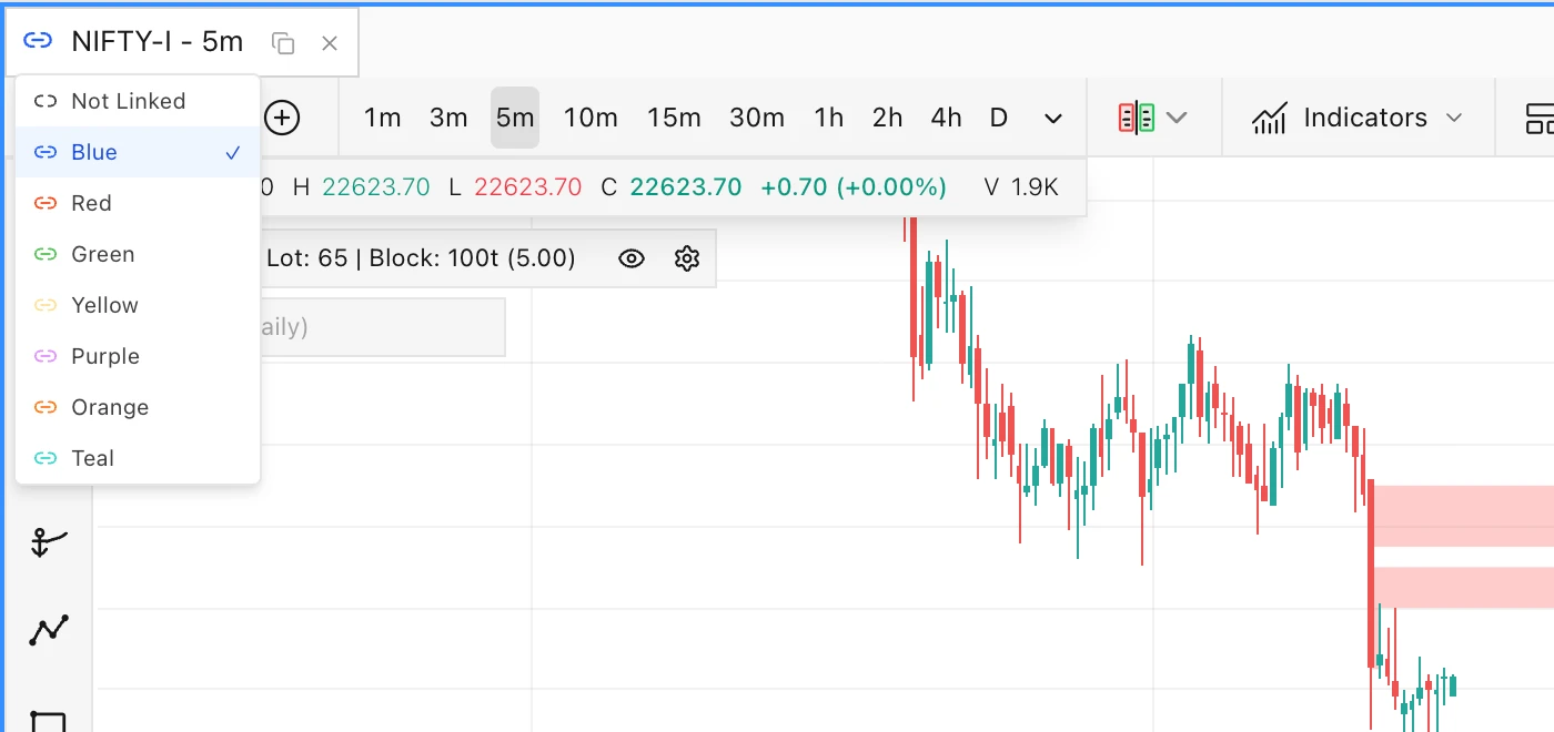
Symbol linking reduces repetitive work when several panels should follow the same selection. In FutPrint, supported modules can share a colour-coded link group. A watchlist selection can then propagate to connected views. The important word is supported: different panels do not necessarily share every setting, and symbol propagation is not the same as synchronising intervals, drawings or all chart options.
Create one link group and test it with two visibly different instruments. Check every linked panel after each switch. Confirm that the contract, exchange and expiry are what you intended, not simply that the label looks familiar. If a panel should preserve a broader market reference while the others change, keep it outside that group. Intentional independence is just as valuable as synchronisation.
Repeat the test after reopening the saved workspace. A setting that appears correct during construction may not represent what was actually saved. Also test how the layout behaves when the requested symbol has no relevant history for one module. A blank or unavailable panel should trigger a data check, not an improvised interpretation of missing activity.
Separate the context clock from the detail clock
Your context chart and investigation chart do not need identical intervals. A broader chart may show the session's main rotations while a finer chart reveals how one boundary was tested. Link the instrument when appropriate, but preserve the distinct purpose of each interval. Otherwise a small change made for detailed inspection can erase the broader structure you were using as a reference.
Non-time bars require an additional check. A Tick Number or Tick Range chart does not have a constant elapsed duration per bar. Two panels that appear visually aligned can therefore represent different spans of time. Compare timestamps and the relevant event, not simply the tenth bar from the right. A conventional time chart remains a useful anchor when moving between constructions.
Document reset boundaries for cumulative studies and session-based calculations. A footprint, a session profile and a cumulative delta line may each use different aggregation rules. They can all be correct while appearing inconsistent. Before inventing a market explanation for the disagreement, check whether you are comparing the same instrument, period, volume source and session definition.
Make states visible before making decisions
The workspace should make it difficult to confuse historical, delayed, end-of-day, replay and real-time information. Inspect the relevant labels and timestamps rather than relying on a moving animation. A panel can refresh its interface while still showing a historical dataset. Similarly, a paper account should remain visibly distinguishable from any other account context throughout a practice exercise.
Keep order-entry controls out of the ordinary path of exploratory clicks when they are not needed. For practice, confirm the selected paper account and quantity before each simulated order. FutPrint's Scalper supports paper accounts; that should not be described as live broker execution. An organised screen cannot correct a mistaken assumption about what a control does.
When a feed appears stale, pause the observation and compare timestamps across panels. Reconnection can produce a burst of updates that looks like sudden market activity. Record the interruption in your study notes. A missing-data interval is a reason to qualify the observation, not to pretend the visible sequence is complete.
A practical layout-building walkthrough
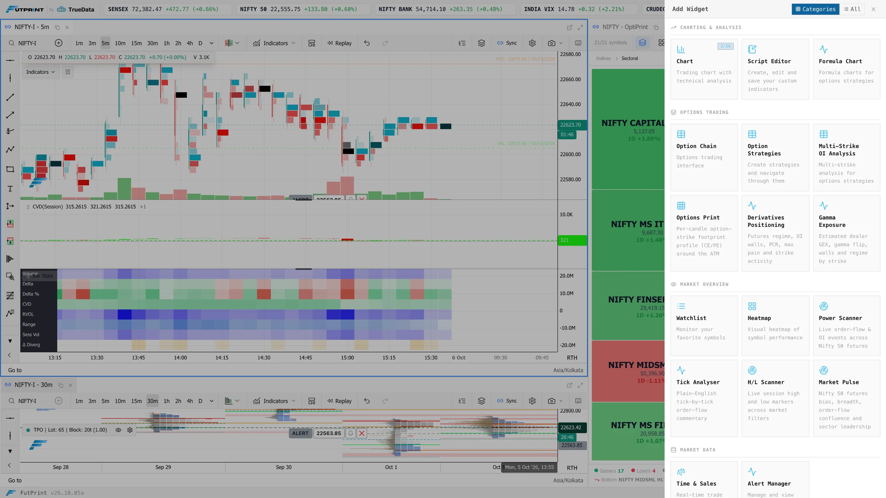
Start with a context chart and add only the levels required for the exercise. Dock a watchlist beside it, leaving sufficient room for complete symbol names. Add an investigation chart in another group and choose a construction suited to your question. Resize until the important numbers remain readable without constant zooming. Save this first version before making further changes.
Next, assign the intended link group and test symbol propagation. Select the initial instrument again and verify the two chart intervals independently. Add a profile or another supporting module only if it answers a defined question. Place less frequently consulted views in tabs. The final layout should communicate which panel to read first without needing an explanation every time you open it.
Name the workspace by purpose, such as “Session preparation” or “Footprint review.” Save explicitly and verify the autosave setting rather than assuming it is enabled. Reopen the workspace and inspect symbols, chart settings and panel sizes. This small verification step prevents a carefully constructed process from depending on temporary state that disappears before the next session.
Design a repeatable observation record
Suppose your exercise is to study what happens when an instrument returns to its prior session range. Before the return, record the instrument, date, selected reference range and current location. Write two plausible outcomes and the observations that would distinguish them. For example, sustained trading inside the range differs from a brief excursion followed by a move back outside.
At the event, capture the context and investigation views together. Record facts separately from interpretations. “Three bars closed inside the range” is an observation under a specified bar construction. “Participants accepted value” is an interpretation that needs a definition. Keeping the distinction visible makes later review more useful because you can challenge the explanation without losing the original evidence.
Afterward, add the outcome without rewriting the initial note. A mistaken interpretation is valuable when the original reasoning survives. If you replace it with a cleaner story after seeing the result, your journal becomes a collection of convincing charts rather than a record of decisions. Preserve uncertainty and cases where the evidence was insufficient.
Reduce alerts and interruptions
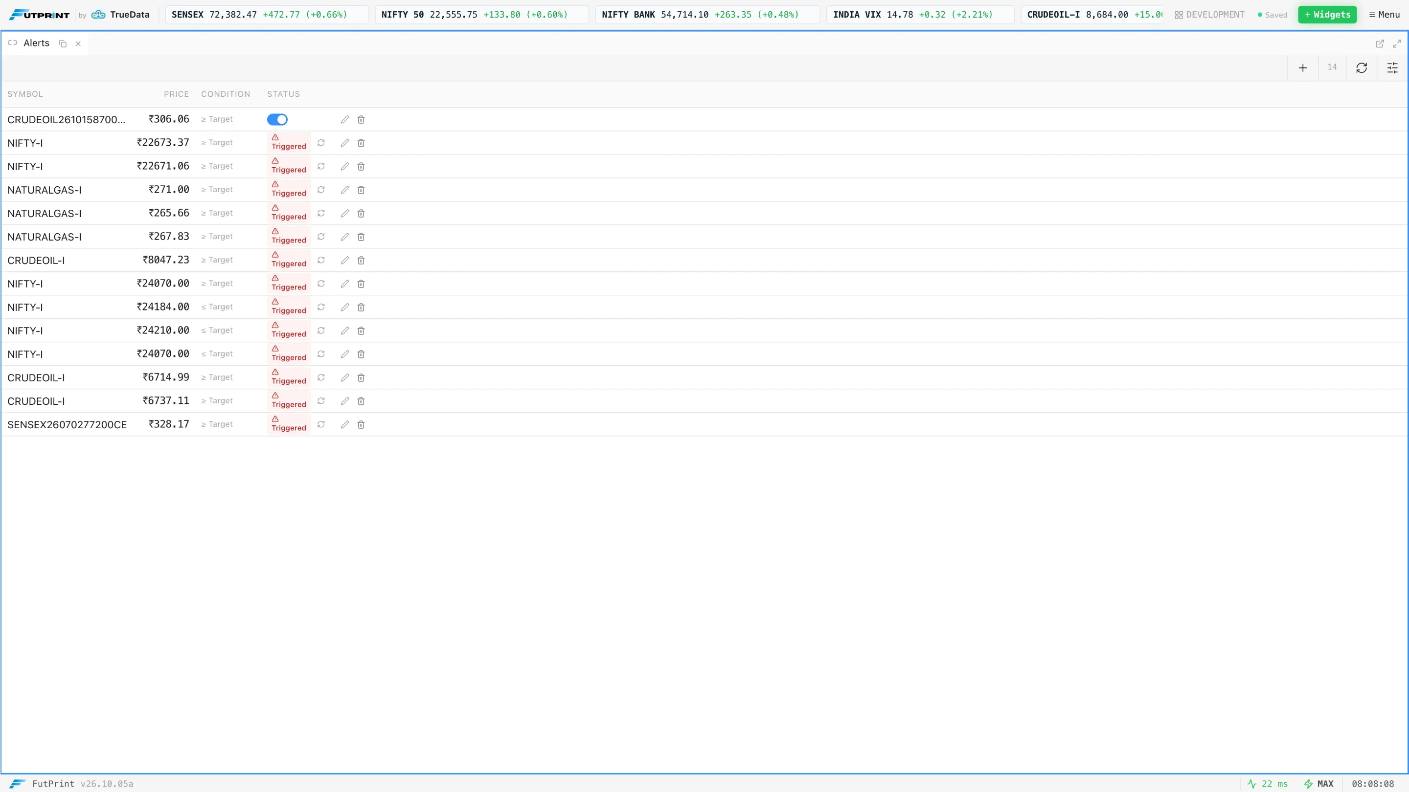
An alert should request attention for a defined reason. Too many alerts train you to ignore them or to abandon your current investigation repeatedly. Start with a small set tied to the references in your plan. Keep the wording specific enough that you can identify the instrument and reason without reopening every panel to reconstruct the context.
Review alert usefulness separately from market outcome. An alert can function correctly but arrive too late for the task, or identify an event that does not matter to your process. Conversely, an alert that leads to no action may still have done its job by bringing you to a planned observation. Count unnecessary interruptions as a workspace cost.
Also simplify visual alerts. Reserve strong colour for a small number of meaningful states, such as selection, data status or a relevant threshold. If every panel flashes with equal prominence, the display stops communicating priority. The most useful information should remain noticeable even when you are tired or reading the screen at a glance.
Evaluate the workspace with a timed drill
Choose five ordinary tasks: identify the current contract, switch to a second instrument, find the prior session boundary, inspect a footprint event and save a review note. Perform them without changing the layout. Note where you search, misclick, resize or lose context. These friction points are more actionable than a general impression that the workspace feels complicated.
Change one design decision and repeat the drill. Perhaps moving a tab eliminates repeated resizing, or keeping an independent context chart prevents accidental interval changes. Do not simultaneously change colours, indicators, panel positions and linking rules. You will not know which adjustment helped, and the new arrangement may simply feel better because it is novel.
Repeat the drill during a quiet session and with a busier historical sequence. A layout that works only when nothing is happening has not passed the relevant test. The goal is not speed for its own sake. It is finding the correct information with fewer errors while preserving enough context to explain what you are seeing.
Maintain the template over time
Keep a short version note when you materially change the workspace. Record which panel or setting changed and why. This helps explain differences between captures made weeks apart. A different row size, reset boundary or symbol source can alter the appearance of familiar patterns without any change in the underlying market behaviour.
Schedule a periodic cleanup rather than redesigning the entire terminal during an observation. Remove unused panels, verify saved settings and refresh the watchlist membership rule. Keep an earlier version until the new one has been tested. A stable template makes repeated study possible; deliberate maintenance prevents stability from becoming attachment to an arrangement that no longer serves its purpose.
A final workspace checklist
- Every visible panel answers a specific question.
- Instrument, contract, interval and data mode are easy to verify.
- Link groups have been tested, including deliberately independent views.
- Numbers and controls remain readable at the intended screen size.
- Saved state has been reopened and checked.
- Review notes preserve observations made before the outcome.
A professional workspace is not defined by how much information fits on the screen. It is defined by whether you can follow a reliable path from question to evidence to review. When each panel earns its place, the terminal becomes easier to use and the reasoning behind your observations becomes easier to examine.
Further reading
These references provide additional explanations of the concepts covered here. Examples and exercises in this guide are original; platform controls and data conventions may differ.