
 by TrueData
Volume Profile: POC, value and the shape of acceptance
A clear guide to reading high-volume nodes, low-volume areas and the prices where business was actually done.
FutPrint by TrueData · Published
Read where business happened
Volume Profile reorganises trading activity along the price axis. Instead of asking how much volume belongs to each candle, it asks how much belongs to each price band within a chosen range. That shift can reveal concentration that is difficult to see in a conventional volume histogram. It is especially useful when your question concerns a trading area rather than a particular moment.
A profile is a historical distribution, not a queue of orders waiting to execute. A wide row says that substantial activity occurred there in the selected data. It does not say the same participants still hold positions there, nor does it guarantee that they will act again when price returns. The distinction matters because profile terminology often encourages more certainty than the measurement supports.
The practical value comes from asking how the current auction relates to a clearly defined earlier distribution. This guide explains how to choose that distribution, interpret its shape, and record profile-based observations without turning every visible level into a prediction.
Define the sample before drawing the profile
The range determines the result. A profile of one session, a week, a consolidation and a single impulse will naturally produce different concentrations. All can be valid if they answer a defined question. Problems begin when the range is repeatedly changed until the Point of Control sits where you want it.
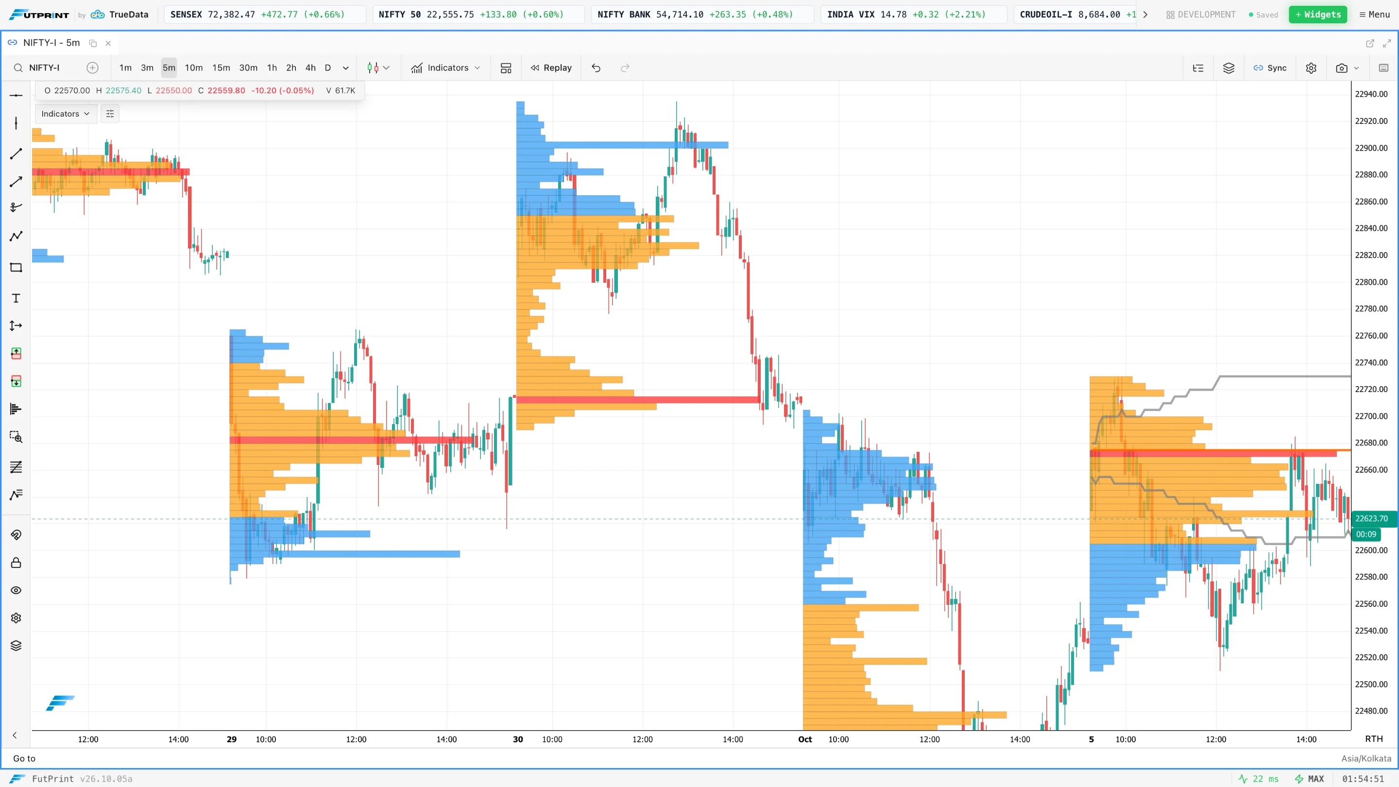
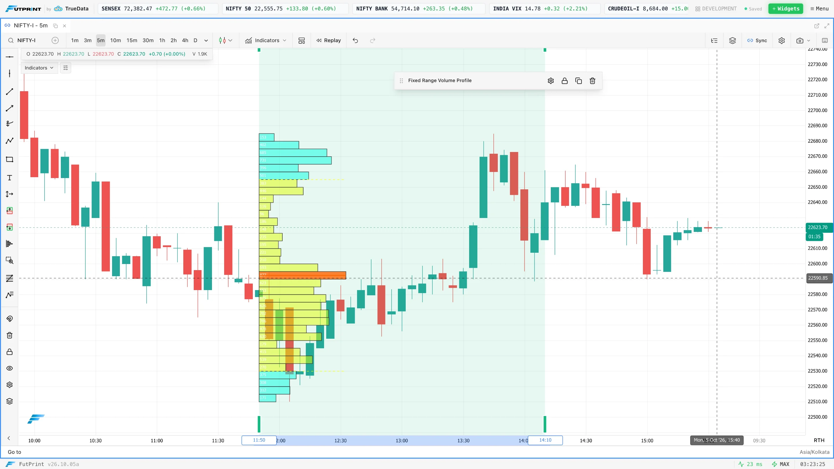
A session profile is suitable for comparing complete trading days with consistent boundaries. A fixed-range profile isolates an interval chosen for a specific reason. A visible-range profile responds to what is currently on screen. The last is convenient for exploration but requires extra discipline: zooming can change the levels even though no new transaction occurred.
Write the start, end and session convention beside any profile used in a review. For futures, record the contract as well. Combining multiple expiries without considering rollover can create a distribution that is difficult to interpret. A stable sample is more important than a beautifully rendered histogram.
What each row contains
At trade-level resolution, each execution contributes its size to the row containing its execution price. If the price increment is 0.05 and rows combine four increments, each band spans 0.20. Broader rows smooth the distribution. Narrower rows preserve more detail but can make ordinary variation look important.
Some tools construct profiles from lower-resolution bars rather than individual transactions. In that case, volume may need to be distributed using an approximation. The resulting chart can be useful, but it should not be treated as an exact reconstruction of where every unit traded. Establish how the platform and feed build the profile before making very precise claims.
Keep aggregation stable when comparing sessions. Changing row size midway through a study changes the measurement. A new node may be a consequence of a finer setting, not a change in the underlying market. Store the settings with each capture so that the profile can be reproduced later.
Point of Control is a mode, not an average
The volume Point of Control, or POC, is the row with the largest recorded volume in the sample. It is a modal location. It differs from VWAP, which is a volume-weighted mean across the entire sample. The two can be close in a balanced distribution and far apart in an asymmetric one.
Consider a simplified distribution with 500 contracts at 100, 300 at 101 and 200 at 104. Its POC is 100. Its volume-weighted average is 101.1, calculated from the total price-times-volume divided by 1,000 contracts. One statistic identifies the most active row; the other balances the whole distribution. Neither calculation identifies an objectively correct future price.
If two rows have equal maximum volume, the platform needs a tie-breaking rule. This is another reason not to attach excessive precision to a single line. Document the surrounding area and the calculation settings, especially when comparing screenshots from different tools.
Value area is a chosen convention
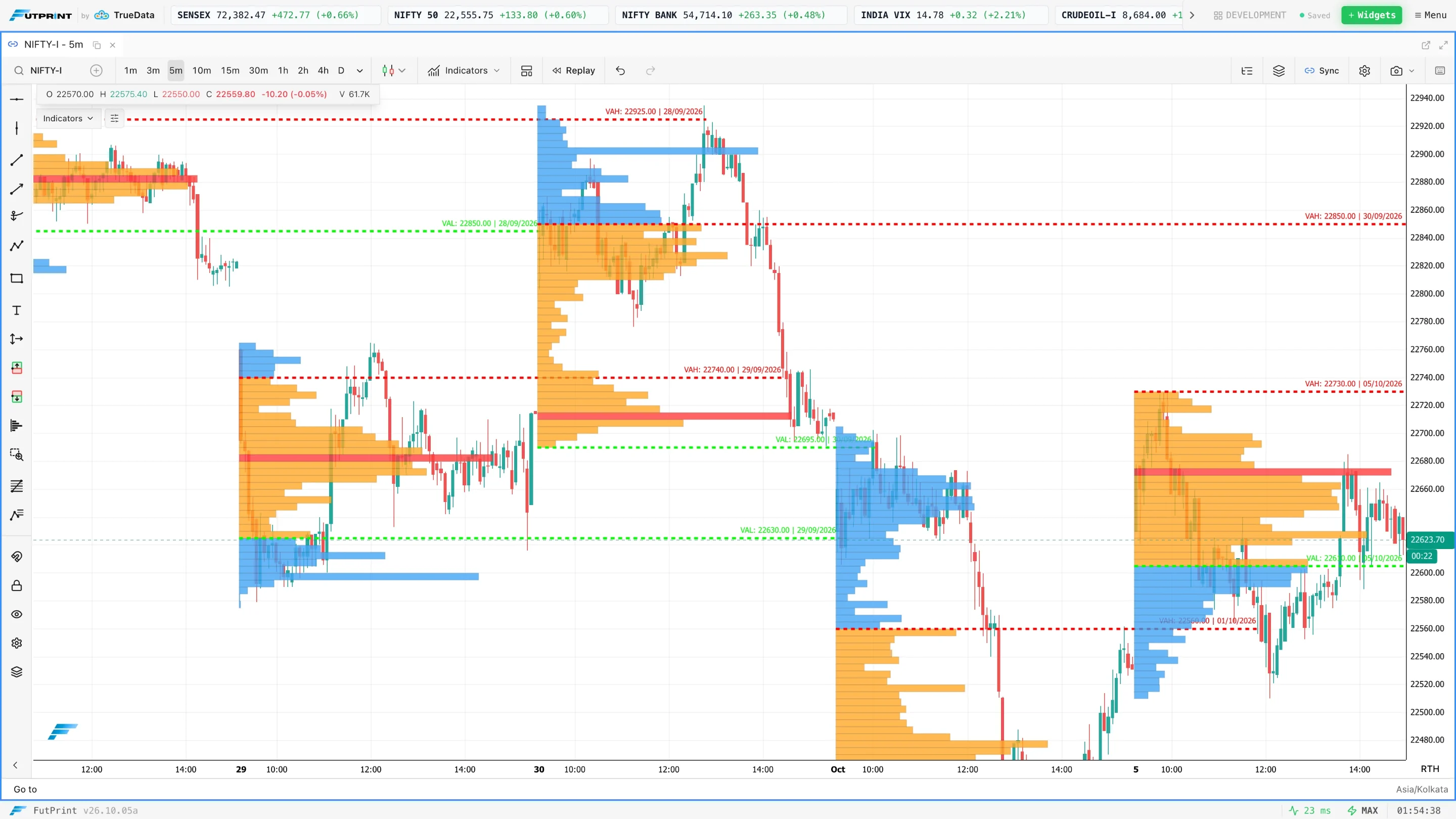
A value area commonly encloses a selected percentage of volume around the POC, often 70%. Implementations differ in how they add adjacent rows, handle ties and treat row pairs. VAH and VAL are the upper and lower boundaries produced by that calculation. They are descriptive outputs, not statistical confidence bounds for tomorrow's price.
Suppose the total profile contains 10,000 contracts and the target is 70%. The algorithm expands from its starting area until it includes roughly 7,000 contracts, sometimes more because rows are added as units. A row cannot necessarily be divided just to land on exactly 70%. Small differences between implementations are therefore possible even with similar inputs.
Use value boundaries to define observations: price is inside, outside, returning to or moving away from the selected distribution. Avoid treating an edge as an automatic buy or sell. The auction's response at the edge supplies information that the historical calculation itself cannot provide.
High-volume and low-volume areas
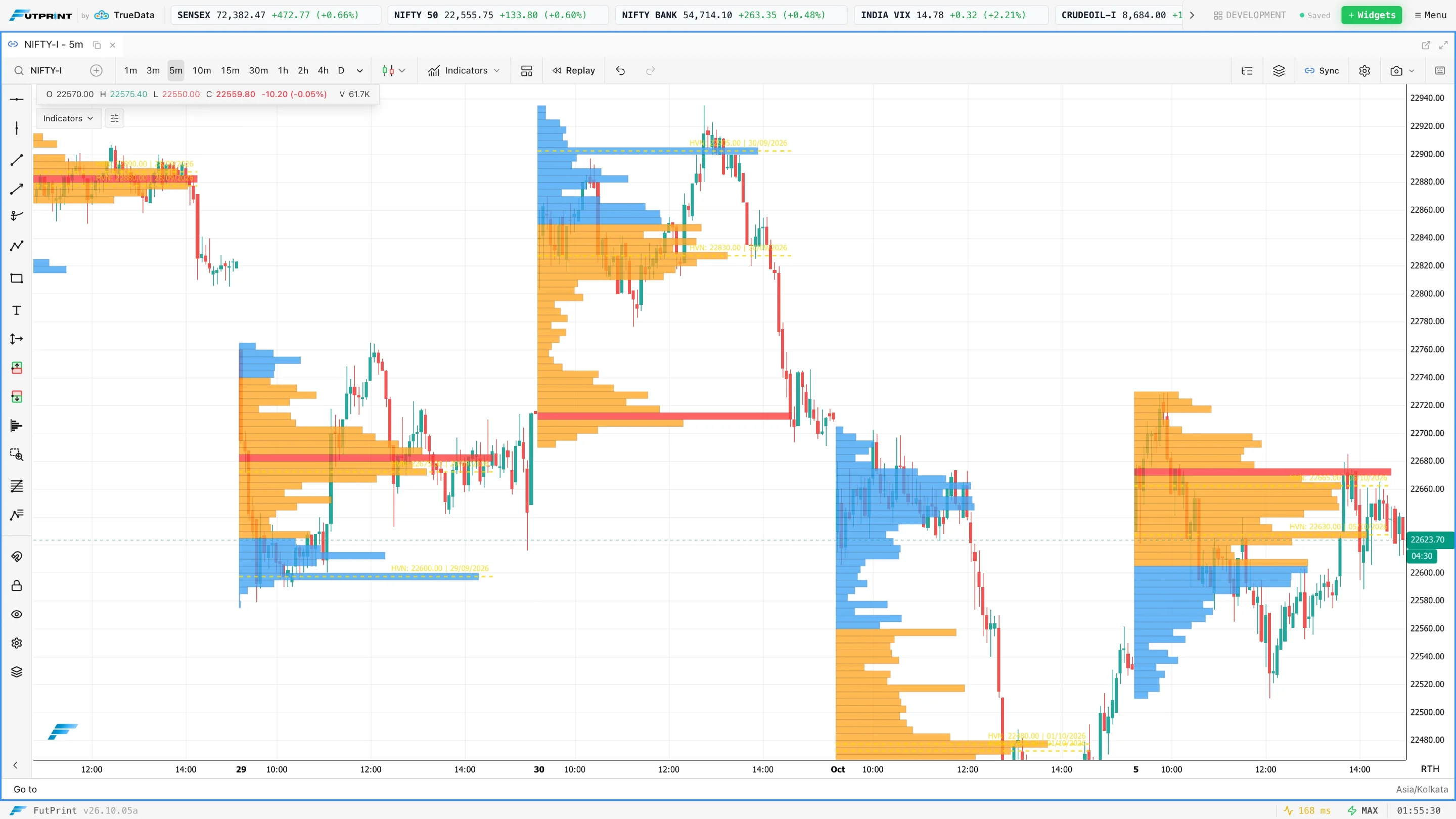
A high-volume node is a local concentration in the histogram. A low-volume node is a relative trough between concentrations. Both depend on scale and the selected sample. A small valley on a one-day profile might vanish inside a larger multi-day distribution, just as a local road disappears on a national map.
High activity can accompany extended two-sided trade, repeated revisits, or a short but exceptionally busy event. Low activity can reflect a fast passage, limited participation, incomplete data or a narrowly sampled interval. The histogram alone cannot distinguish all of these explanations. Return to the time chart when the process behind the shape matters.
If price revisits a low-volume area, observe whether it passes through again or starts transacting there. New activity can change the relevance of an old trough. The language of "repair" is a convenient description for filling in a distribution, not evidence that the market is obliged to complete unfinished business.
Interpret shapes without assigning hidden motives
A broadly balanced profile has a central concentration and smaller extremes. A double distribution has two notable concentrations separated by a thinner region. A stretched distribution may accompany directional movement. These labels help summarise a sample, but the shape cannot identify whether short covering, new buying or a particular institution caused it.
For example, a top-heavy profile might arise from an early advance followed by hours of trade near the high. It could also arise from a late high-volume event. Both finish with more activity near the upper part of the range. Their chronological stories differ, so use time and session markers before assigning a cause.
The strongest description names both the shape and its construction: "the session advanced early, then built a second concentration above the opening range." That is more precise than attaching a letter-shaped label and assuming a directional implication. It also makes subsequent comparisons easier to review.
Worked example: opening outside prior value
Imagine yesterday's profile has a VAL of 500, a POC of 506 and a VAH of 512. Today opens at 516. These hypothetical numbers establish location, not a trade recommendation. The immediate question is whether new trading develops above the old distribution or whether the market returns to it.
In one scenario, the first rotation holds above 512 and subsequent volume builds near 517. A later pullback also finds sustained trade above the previous boundary. The developing profile supports the observation that the session is constructing a higher area. In another scenario, price quickly falls below 512 and spends repeated intervals around 506.
Do not use the completed afternoon profile to claim you knew the outcome at the open. Keep snapshots at the decision times. What was visible at 09:30 may differ materially from the final histogram. This separation is essential when turning a profile interpretation into a testable review process.
Combine profile with execution data
Profile provides a location framework. A footprint or tape can describe what happens during a particular test of that framework. At a prior value edge, you might ask whether aggressive transactions move price away, whether activity accumulates with little progress, or whether the level is crossed repeatedly without a clear response.
The combination is useful because the measurements have different scopes. A session profile compresses many transactions into a distribution. A footprint preserves their price allocation inside individual bars. Neither display introduces an independent population of traders. Treat them as different resolutions of evidence rather than multiple votes for the same conclusion.
Also consider whether the level is still relevant. A strong news event, a large gap or a change in the traded contract can make yesterday's distribution a less useful immediate reference. You can retain it as context while allowing the current session to establish a new structure.
Use the profile carefully in Indian instruments
A profile built from a specific futures contract describes trading in that contract. A profile on an option describes that option premium's traded distribution, which can move for reasons beyond the underlying's direction. A cash index does not provide the same direct trade tape as either instrument. Always identify the volume source.
For an option, record expiry and strike and consider whether activity is sufficient to support a meaningful distribution. A wide bid–ask spread or sparse trades can make an apparently precise profile deceptive. Comparing a heavily traded at-the-money contract with an inactive strike requires more than matching chart settings.
Within FutPrint, use the documented profile tools and check the plan's data timing. End-of-day information can support completed-session study, while live interpretation requires appropriate live data. Do not infer that a profile is live simply because the chart is open during market hours.
Settings checklist and troubleshooting
- Confirm instrument, contract and the volume unit before interpreting size.
- Record the selected range and session start so the profile can be reproduced.
- Choose a row size that preserves useful structure without excessive detail.
- Keep the value-area percentage consistent across the comparison.
- Check whether changing zoom also changes the measured range.
- Investigate missing or delayed data before interpreting an unusual empty region.
If the profile appears radically different after reloading, compare the range first, then row aggregation and session boundaries. If those match, check data completeness and whether the historical view uses the same source resolution as the live view. A calculation discrepancy is a data question before it is a market story.
A structured profile study
Select ten consecutive sessions for one instrument. For each, record the opening location relative to the previous value area, the early developing POC, the final POC and the closing location. Add two captures: one from the first observation period and one from the close. This creates a compact record of how the distribution evolved.
Classify what you see before looking for a trading rule. Which sessions built outside prior value? Which returned? Which repeatedly crossed the boundary? Do the same-looking openings produce different outcomes when the earlier session was balanced versus directional? These questions encourage comparison rather than cherry-picking.
Finally, repeat the exercise without changing profile settings. If your conclusions depend on continuously adjusting the range, they may describe your selections more than the market. A useful profile workflow gives you stable references and a clear account of how present activity relates to them, even when no obvious opportunity follows.
Check the sensitivity of a profile
A useful second exercise is to compare the same sample at two adjacent row sizes. Keep the start and end fixed. Note whether the main concentration remains in roughly the same area and whether a narrow low-volume pocket disappears when neighbouring prices are combined. The disappearance does not mean the smaller profile was wrong. It shows that the feature depends on the resolution at which you describe the distribution.
Next, compare a completed session with the profile that was available halfway through it. A final POC can be very different from the developing POC visible during an earlier decision. Mark both and identify when the concentration migrated. This prevents the common mistake of interpreting an early reaction using a reference that only became established later.
For every saved example, preserve the range, row size, session and capture time alongside the image. Those details allow another reader to reproduce the display and separate a market observation from a settings effect. A profile becomes a useful research object when its construction is explicit, rather than an attractive shape whose boundaries can be changed until the story appears convincing.
Further reading
These references provide additional explanations of the concepts covered here. Examples and exercises in this guide are original; platform controls and data conventions may differ.